

Nebula Brand Identity
Overview
Nebula needed a brand that felt both futuristic and timeless — a visual language that could scale from product UI to large-format installations without losing its editorial soul.
Challenge
The client operated at the intersection of AI and human creativity. The identity had to communicate technological sophistication without feeling cold or generic.
Solution
We developed a modular identity system anchored by a custom wordmark, a restrained cosmic color palette, and a grid-based layout language that mirrors architectural precision.
Process
Discovery & competitive audit
Moodboarding & art direction
Logo exploration (40+ iterations)
Typography & color system
Brand guidelines & templates
Launch assets & motion
Gallery
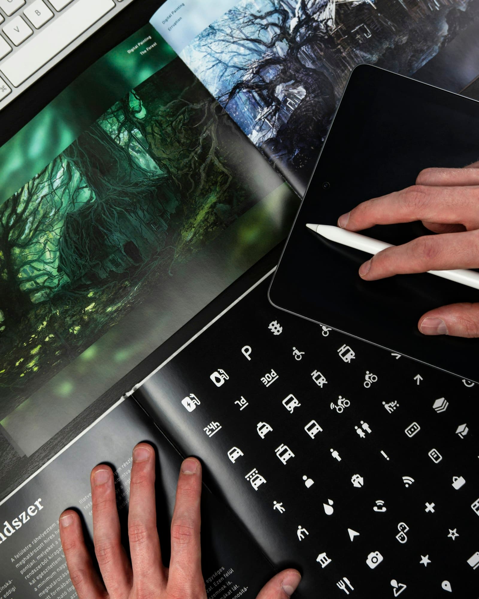
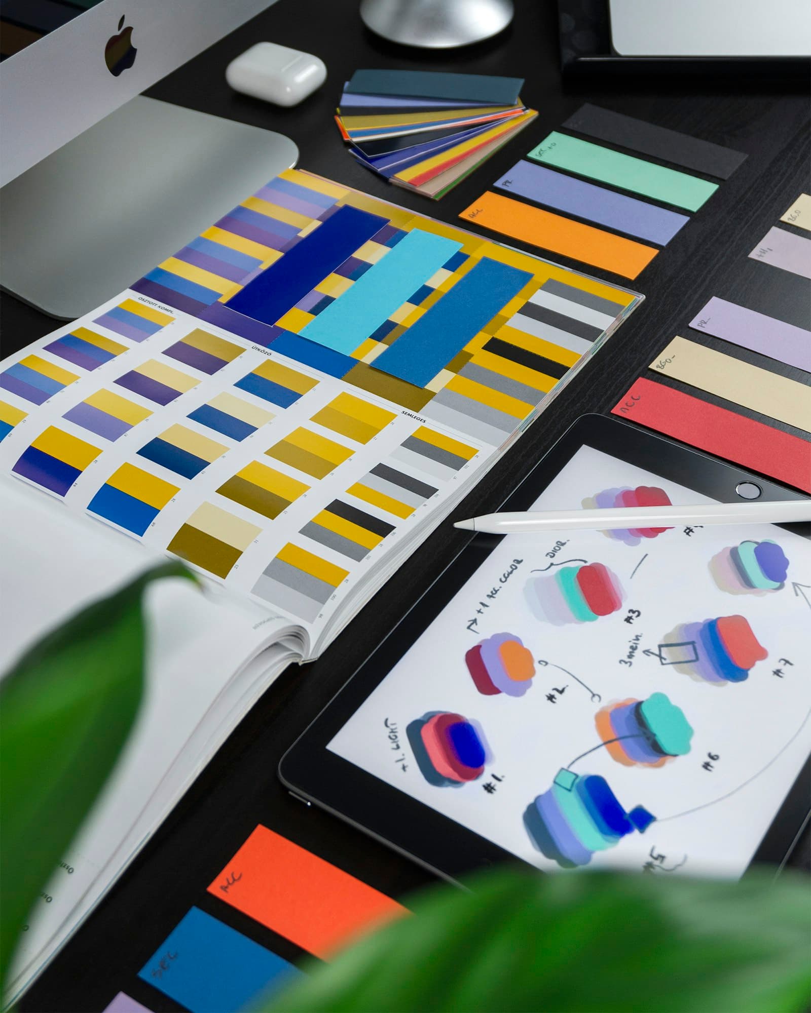
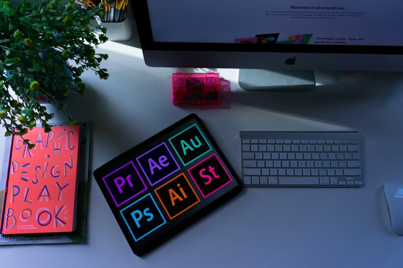
Mockups
Typography
Instrument Serif
Outfit
A serif-sans pairing that balances editorial elegance with digital clarity.
Color Palette
Cosmic Black
#1A1A2E
Nebula Violet
#6C63FF
Stardust
#F0EEF8
Orbit Gold
#B89B5E
Deliverables
- Logo system
- Brand guidelines
- Stationery suite
- Social templates
- Motion identity
Results
- 340% increase in brand recognition
- Featured on Behance curated gallery
- Adopted across 12 product touchpoints